SAVORY SNACKS: Label Redesign
PACKAGING DESIGN | 2023
CREATIVE BRIEF
In 2023, I was tasked with redesigning the Snack labels for Savory Hospitality. The previous design lacked uniqueness and the added luxury clients were paying for.
CONCEPT & STRATEGY
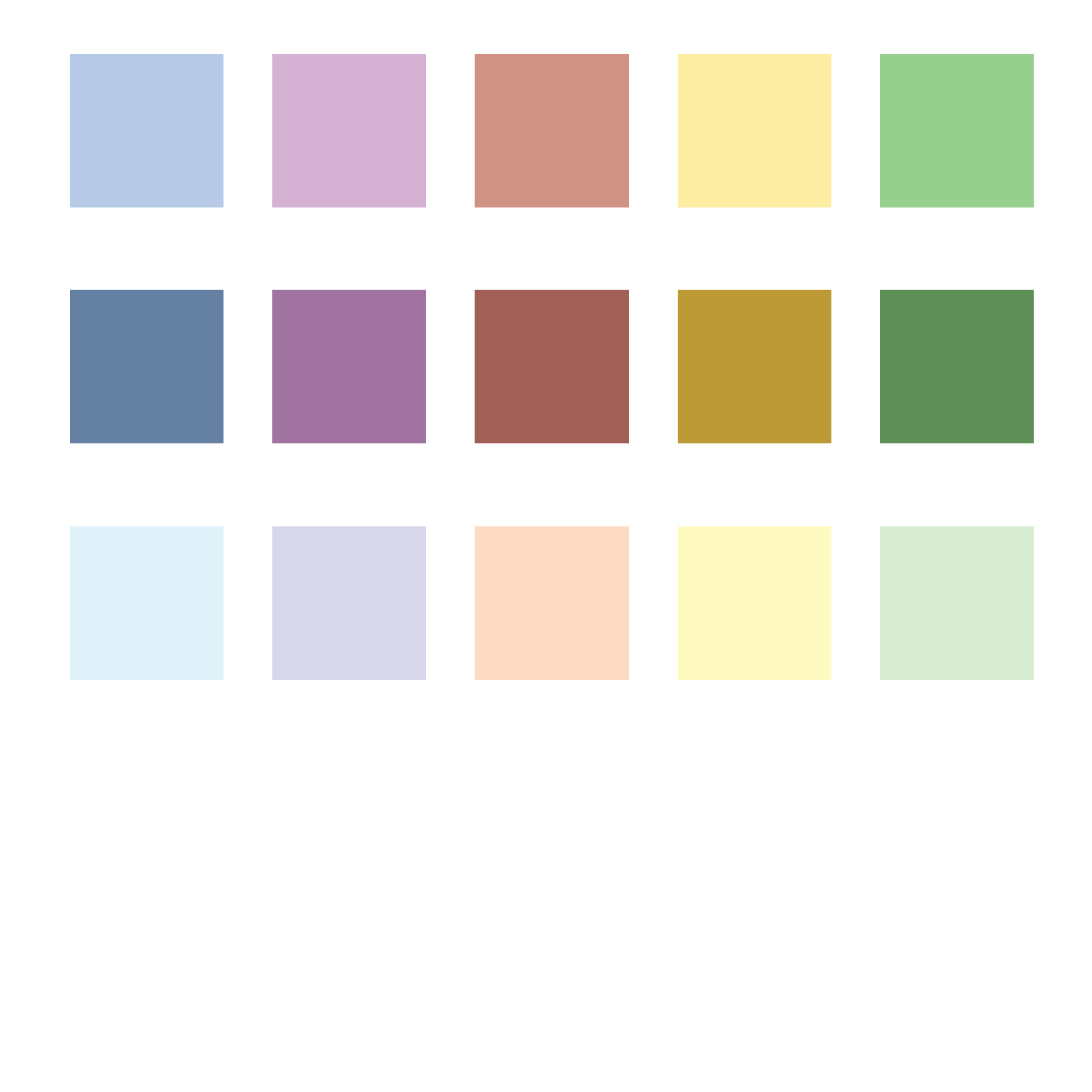
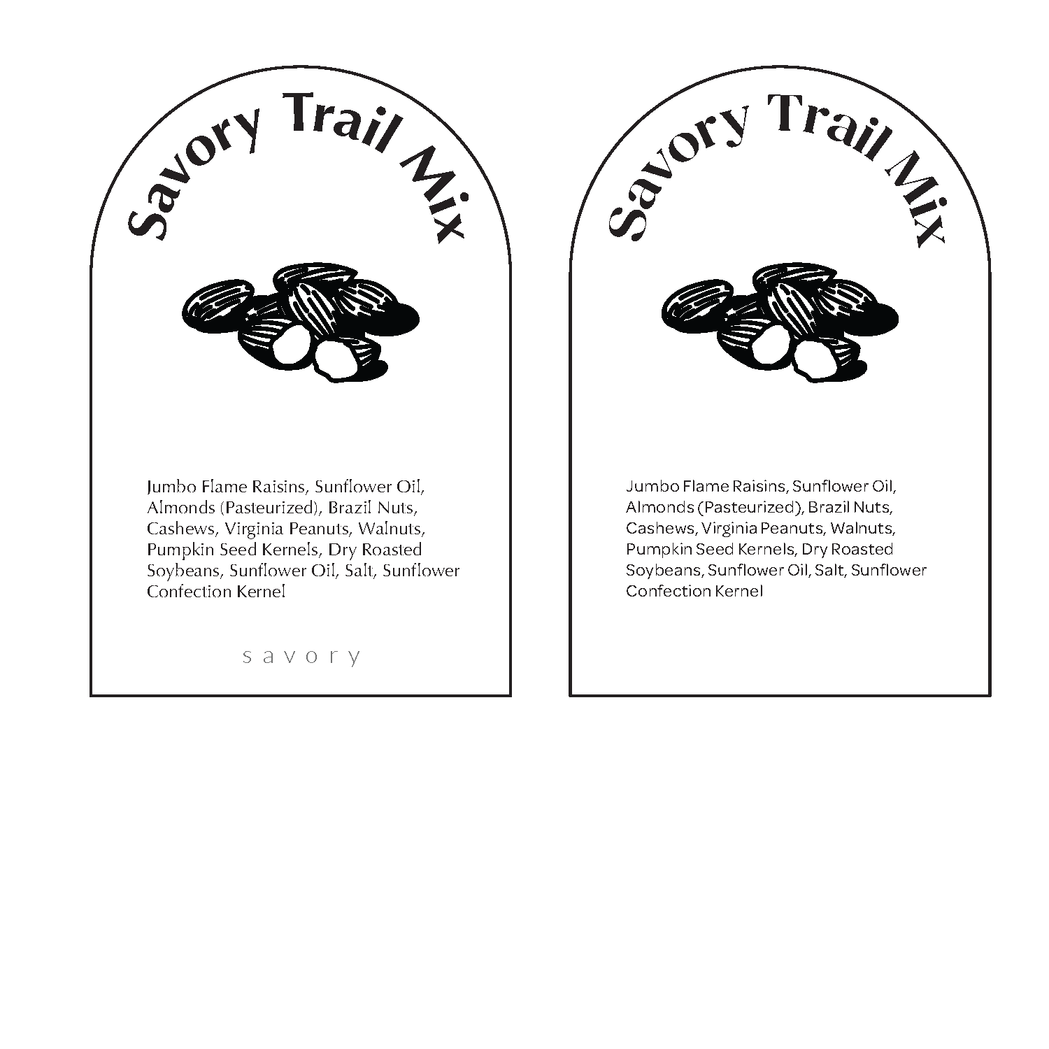
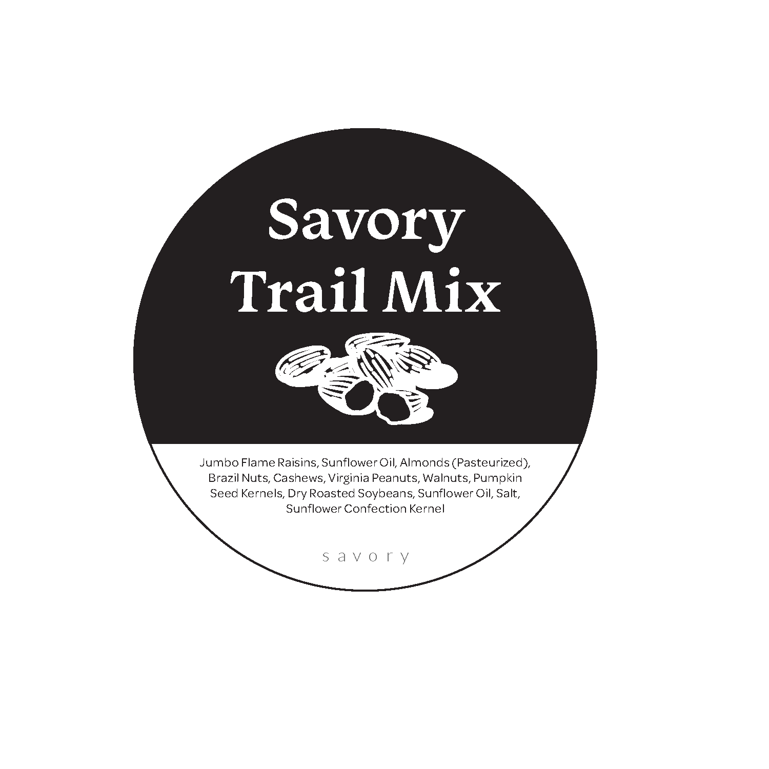
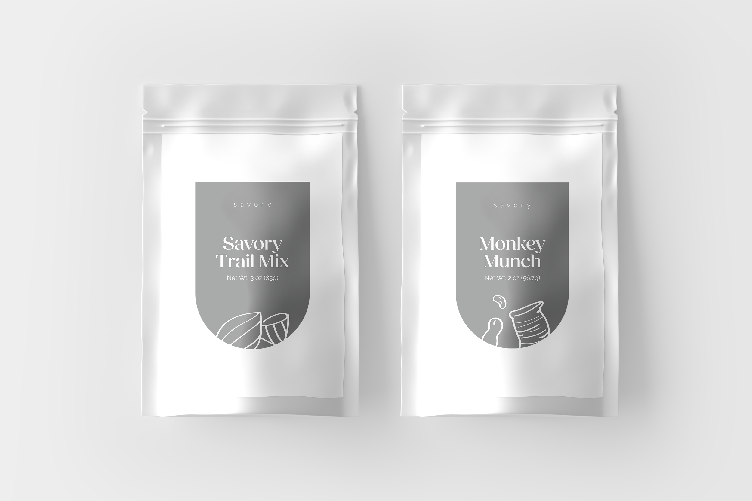
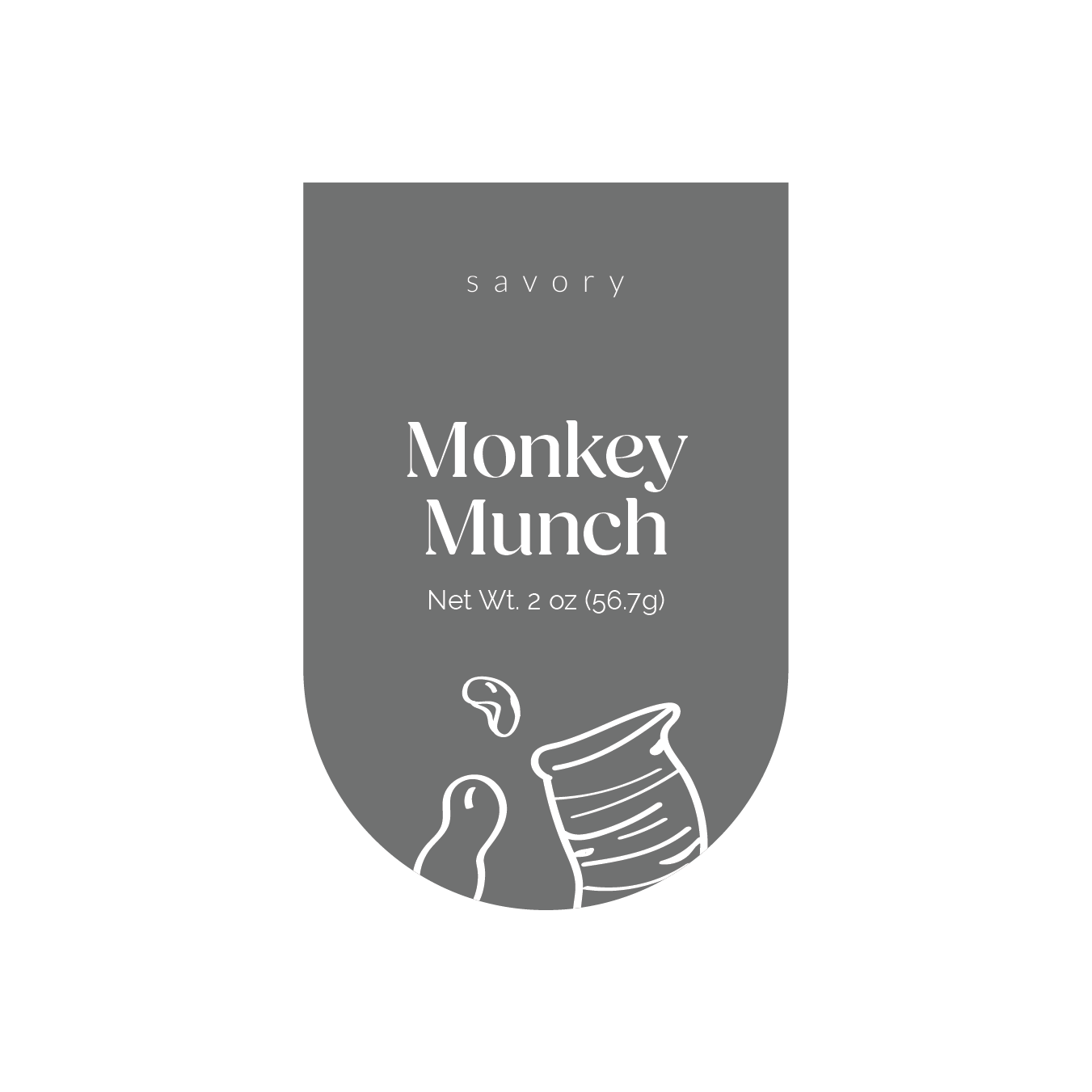
Brand colors were used for continuity and hand drawn illustrations to differentiate from competitors. A unique arch shape was introduced to better fit the current packaging.
Discovery
The previous designs were printed in house and were generic square stickers. Design was inconsistent due to human error and looked pasted on. Typefaces were not within brand guidelines and did not match brand standards.
Sketches
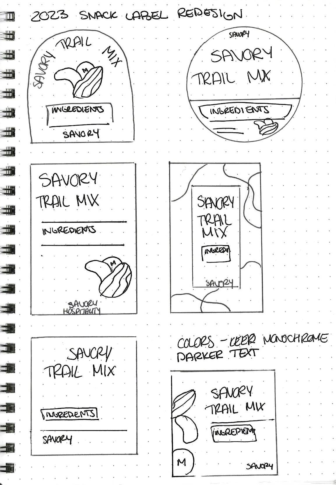
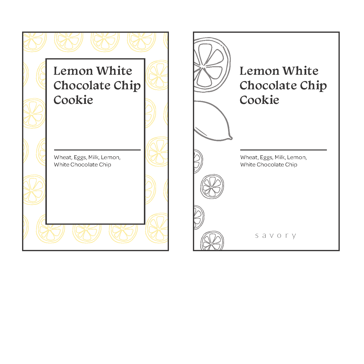
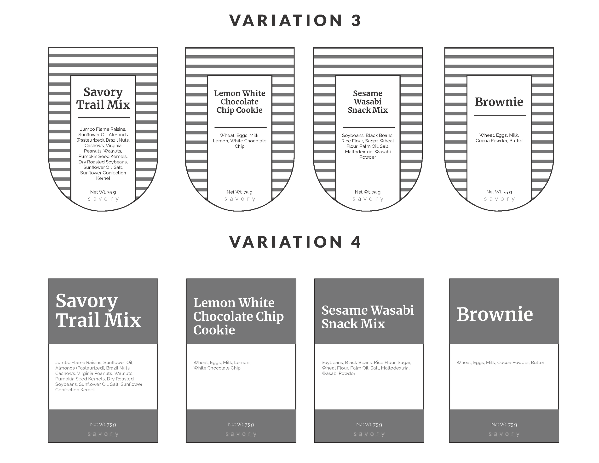
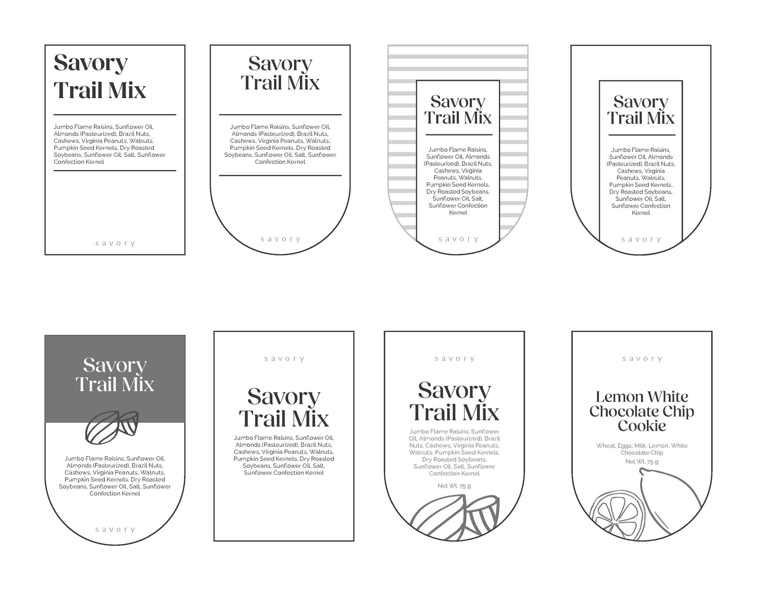
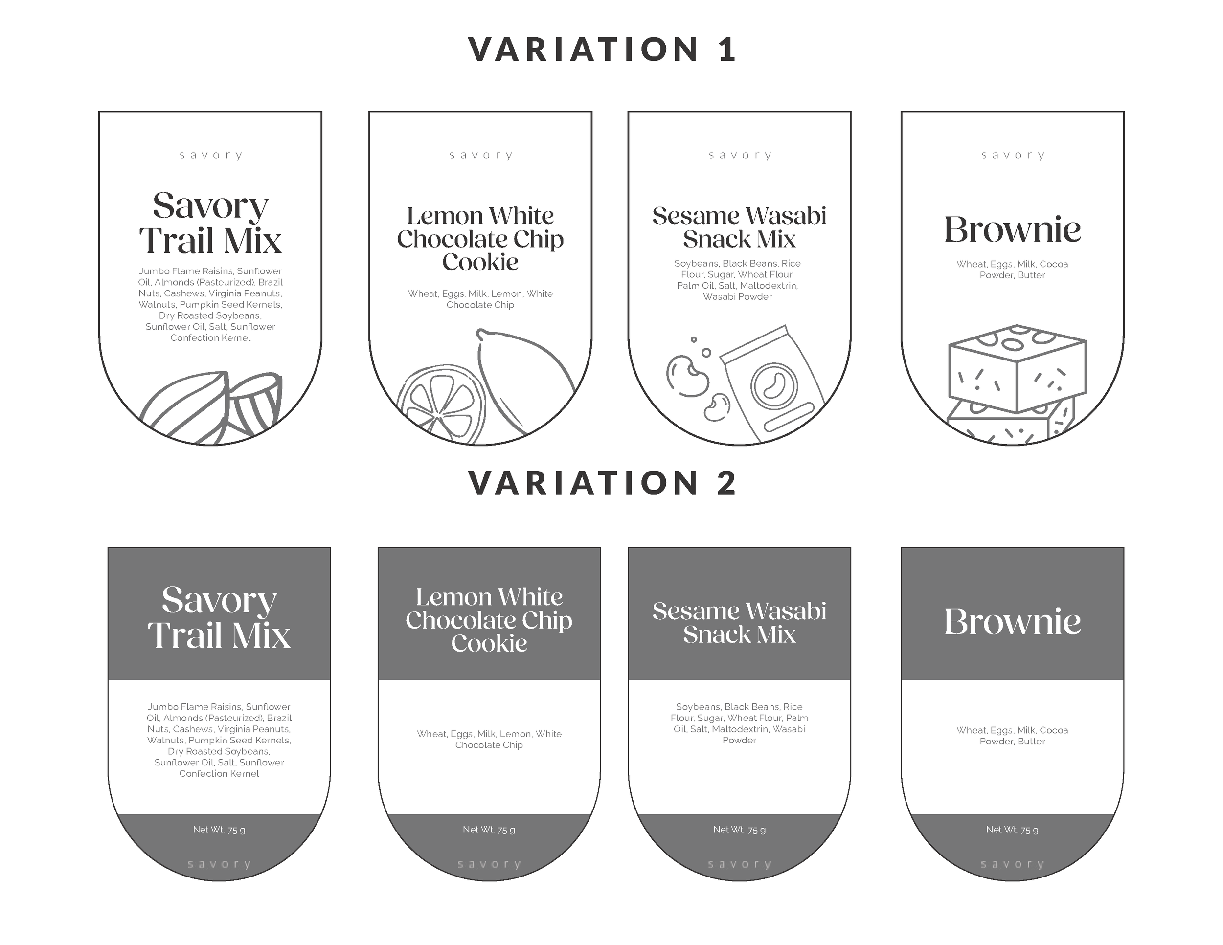
Various different compositions were explored as well label shapes. Brand elements such as illustrations, color, and type were explored as well.
Design Development
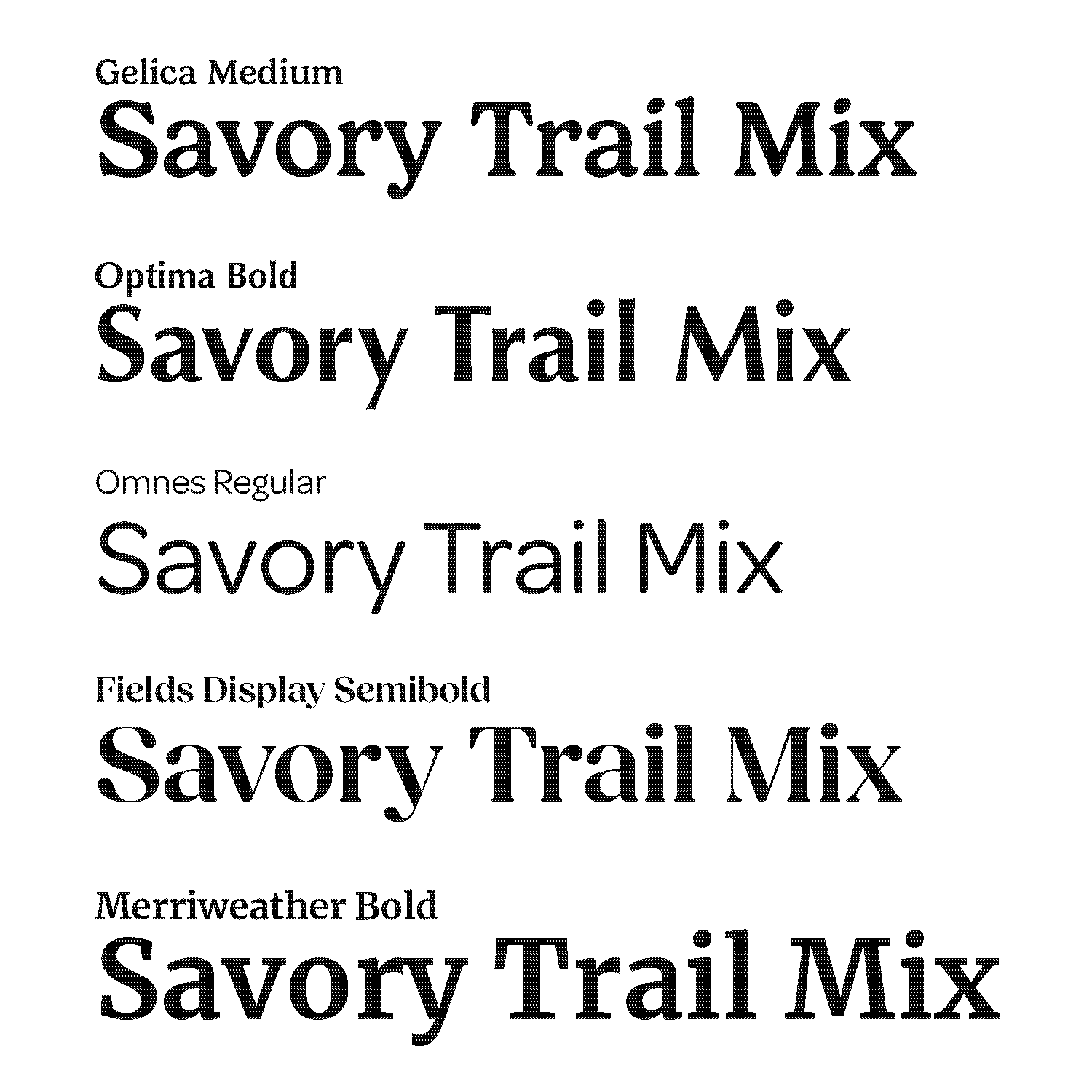
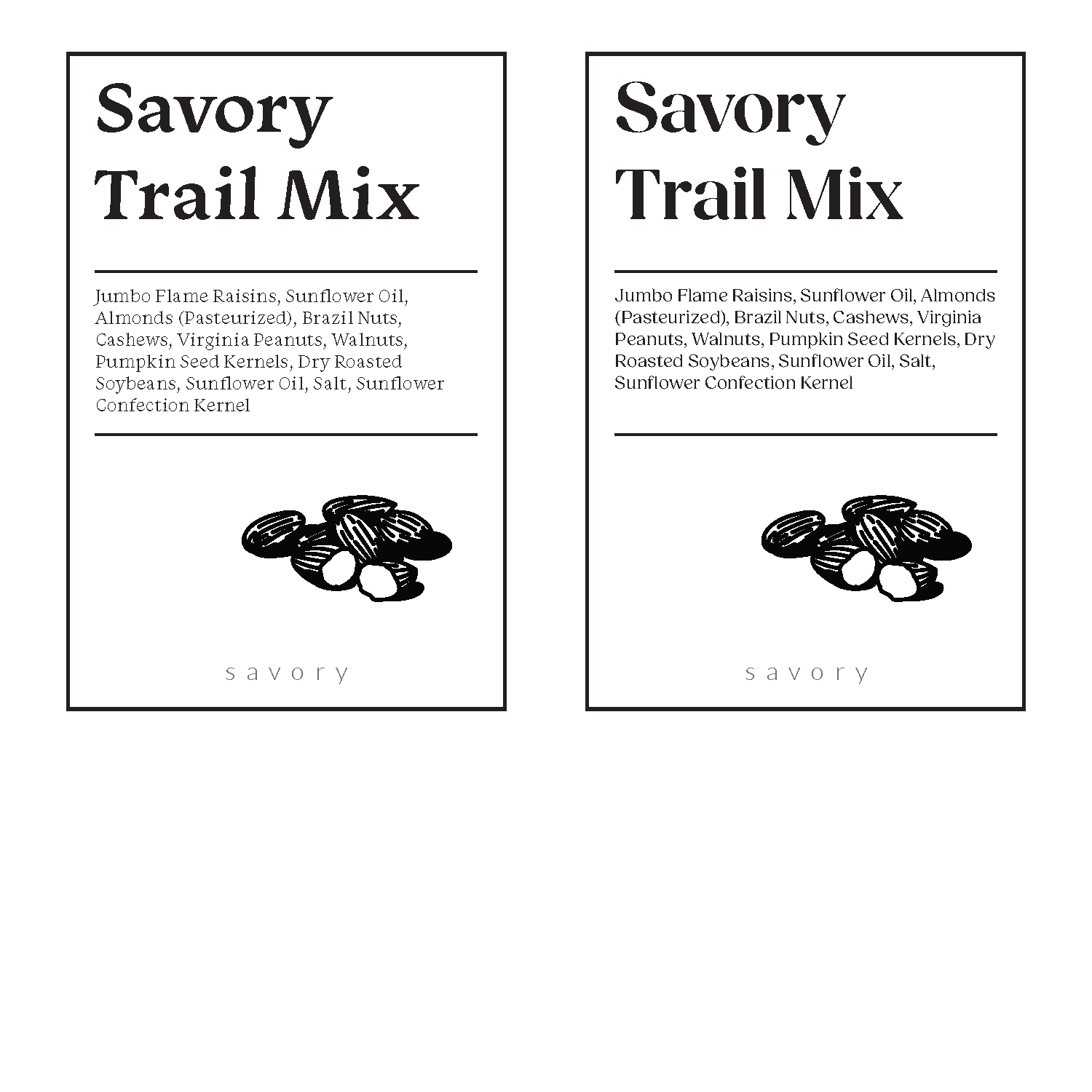
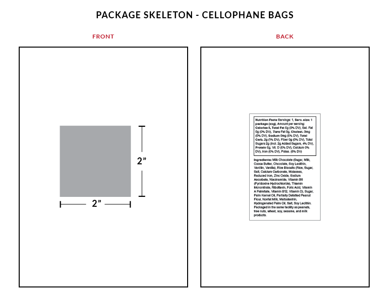
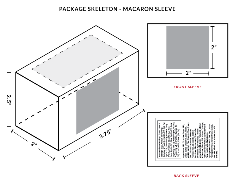
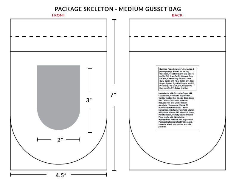
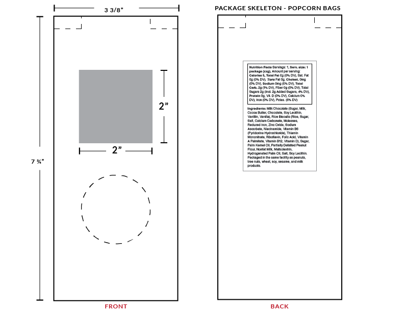
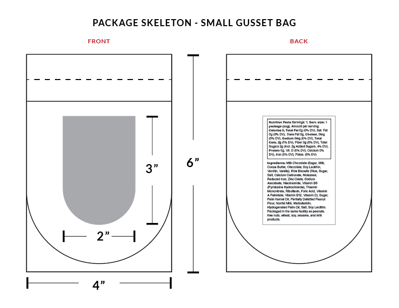
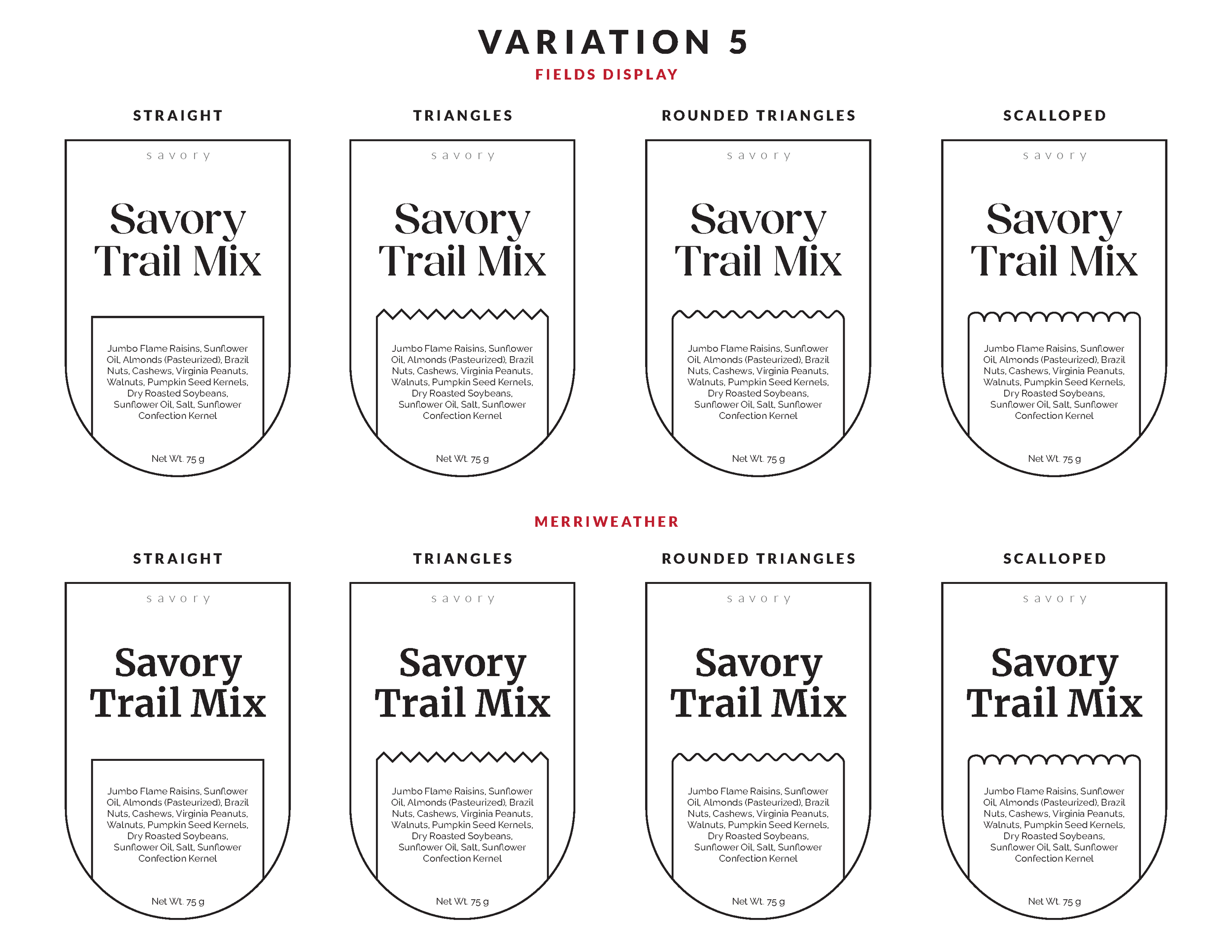
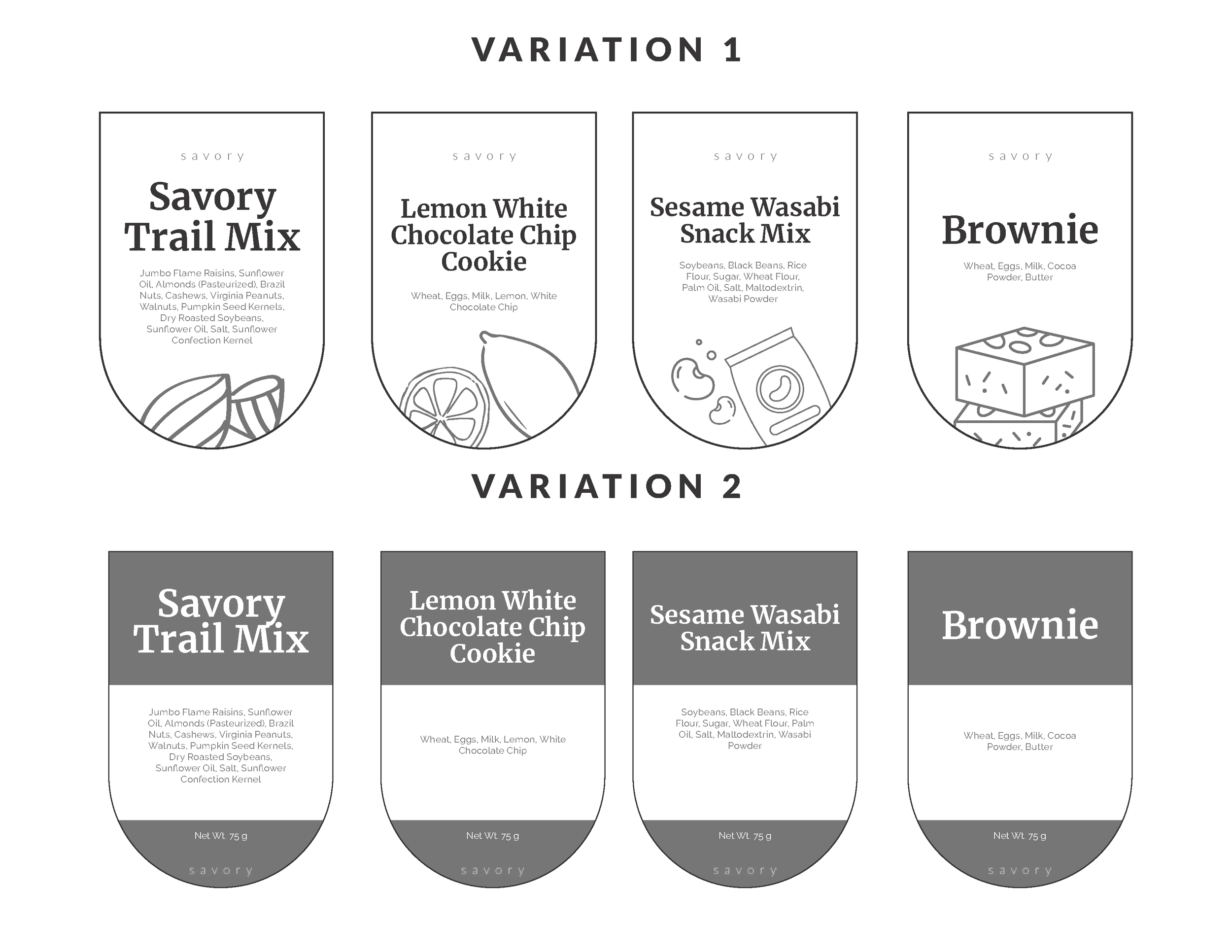
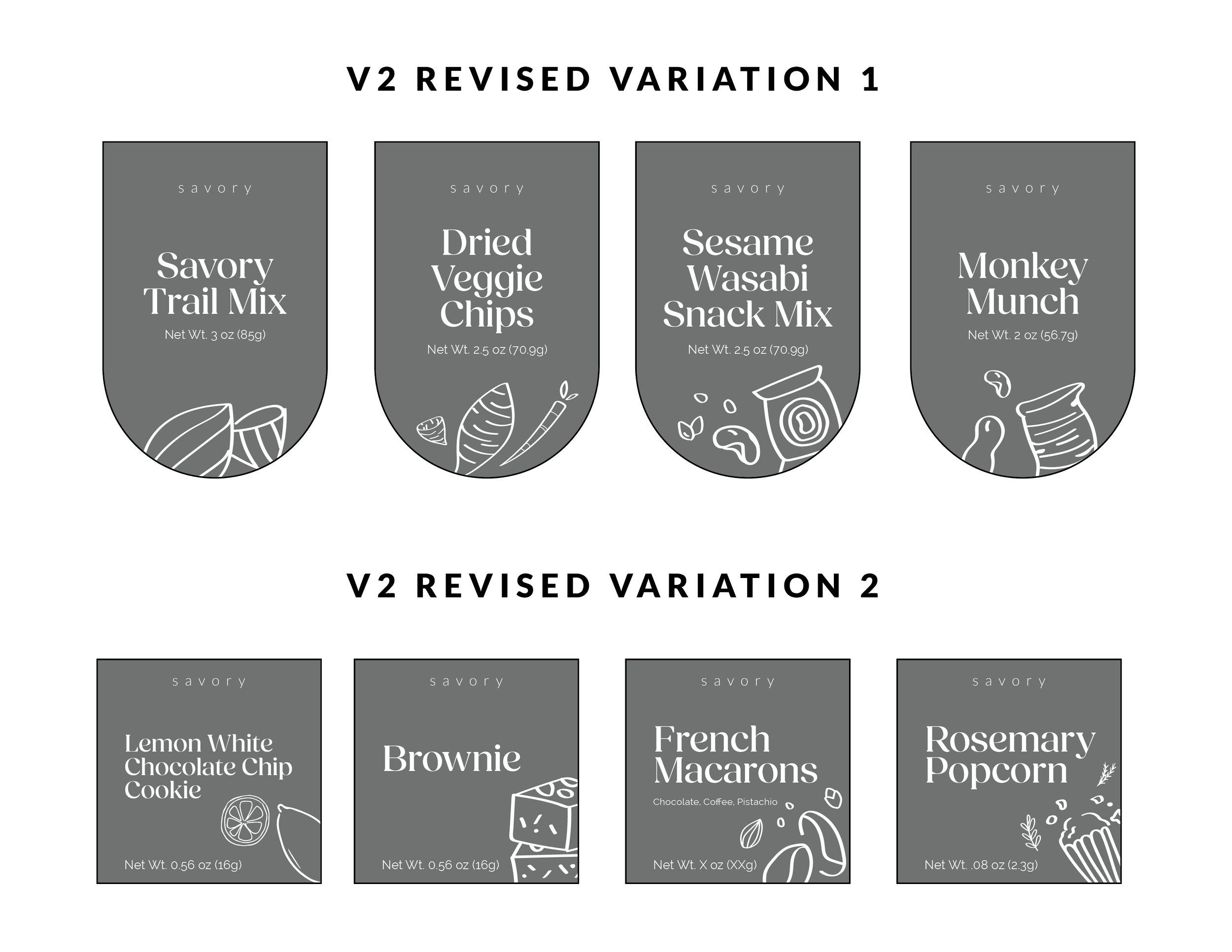
After consulting with the Creative Director on the direction of the project, I designed several variations using different typography and compositions. We decided in the end on the arch shape mimicking the shape of the cellophane bag. Measurements and packaging skeletons were created to showcase the exact dimensions of the label on the snack containers. Mock nutritional labels were designed as well to simulate the entire design.
Final Deliverables
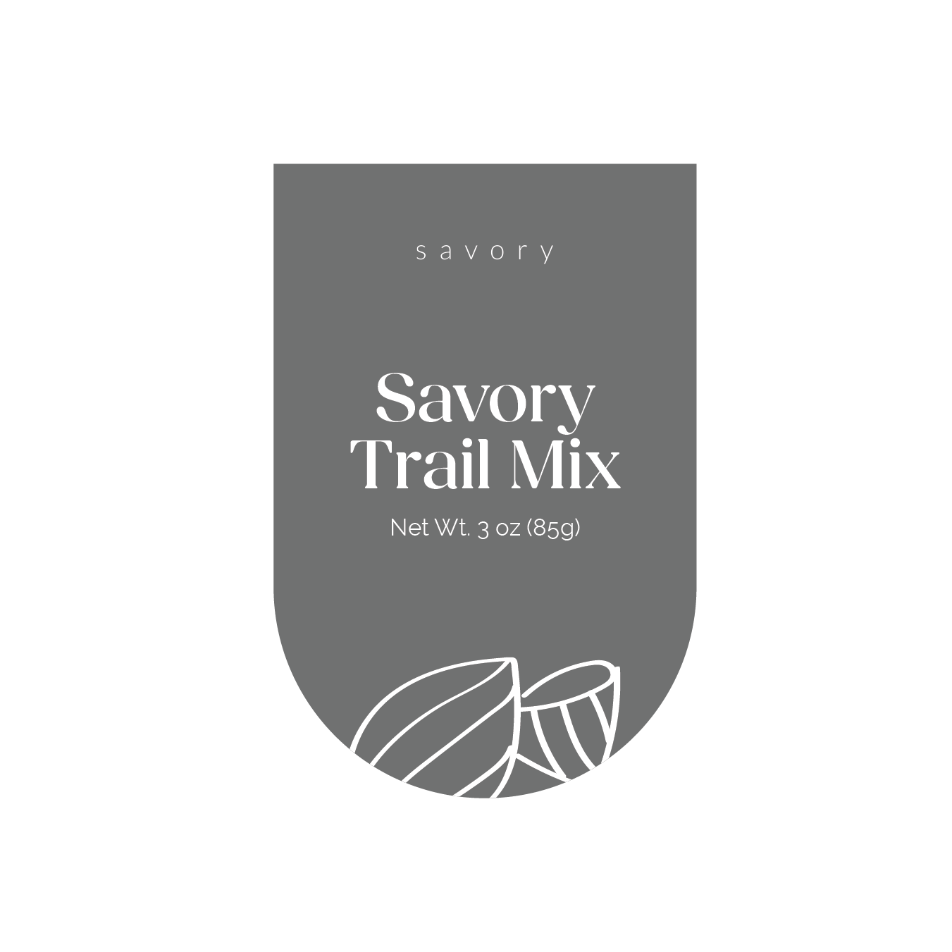
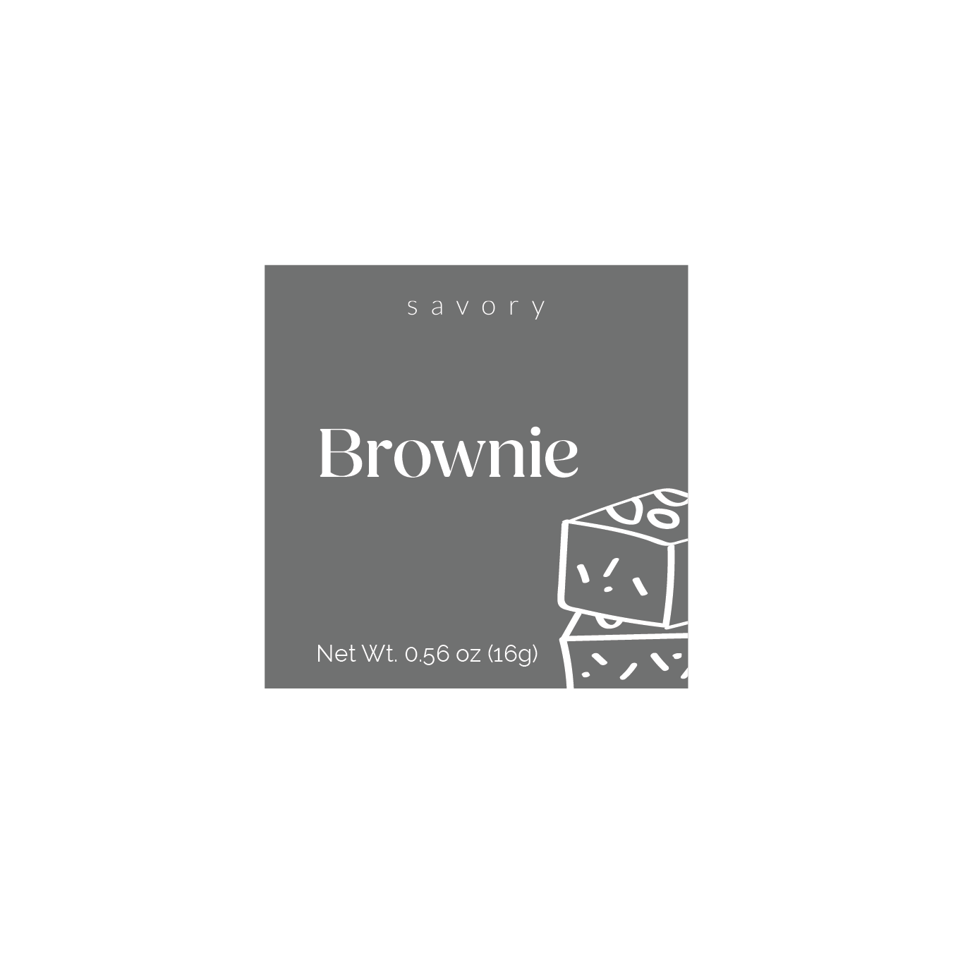
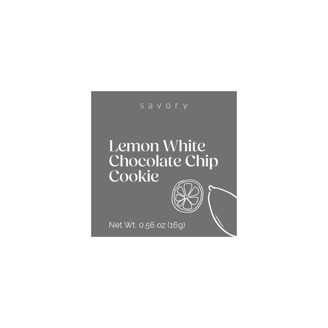
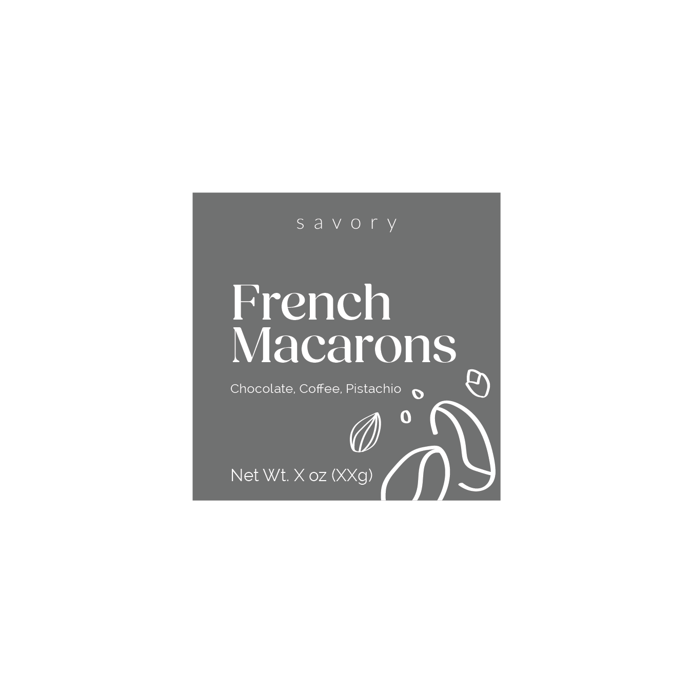
The final design utilized a full bleed background with white typography to emulate the luxe nature of the brand. The hand drawn custom illustrations bring modernity and a playful and approachable nature to the packaging.

Creative Director
Katie Minucci
Creative Strategy & Graphic Designer
Adrika Hoque


